
Nothing makes your heart stop and skip a beat quite like when your WordPress website misbehaves for your users. Whether it’s high bounce rates, problems with the WordPress admin area, or general confusion using your site, spending time optimizing your website for the best user experience (UX) pays off in spades.
Anchor & Alpine has built over 100 WordPress websites in our 17 years in business. And they last a long time. We’ve learned a lot about UX design optimization for WordPress because our sites and clients stick around for a long time. We don’t churn and burn our clients, so we hear about things that could be better and we have the opportunity to fix them. Below are some of our favorite UX optimizations for WordPress websites.
UI/UX in Website Design
Having a strong user interface (UI) and user experience (UX) focus in your web design will ensure your website is targeted, correct, and delightful. These terms are often combined to be UIUX.
START BY UNDERSTANDING YOUR WEBSITE VISITORS
With most UI/UX projects, we start with Personas. Personas are cards that help you understand your ideal customer profile (ICP). It’s important to remember that these are not demographic they are psychographic—meaning they consider the motivations, intent, and technical acumen of each of your persona buckets.
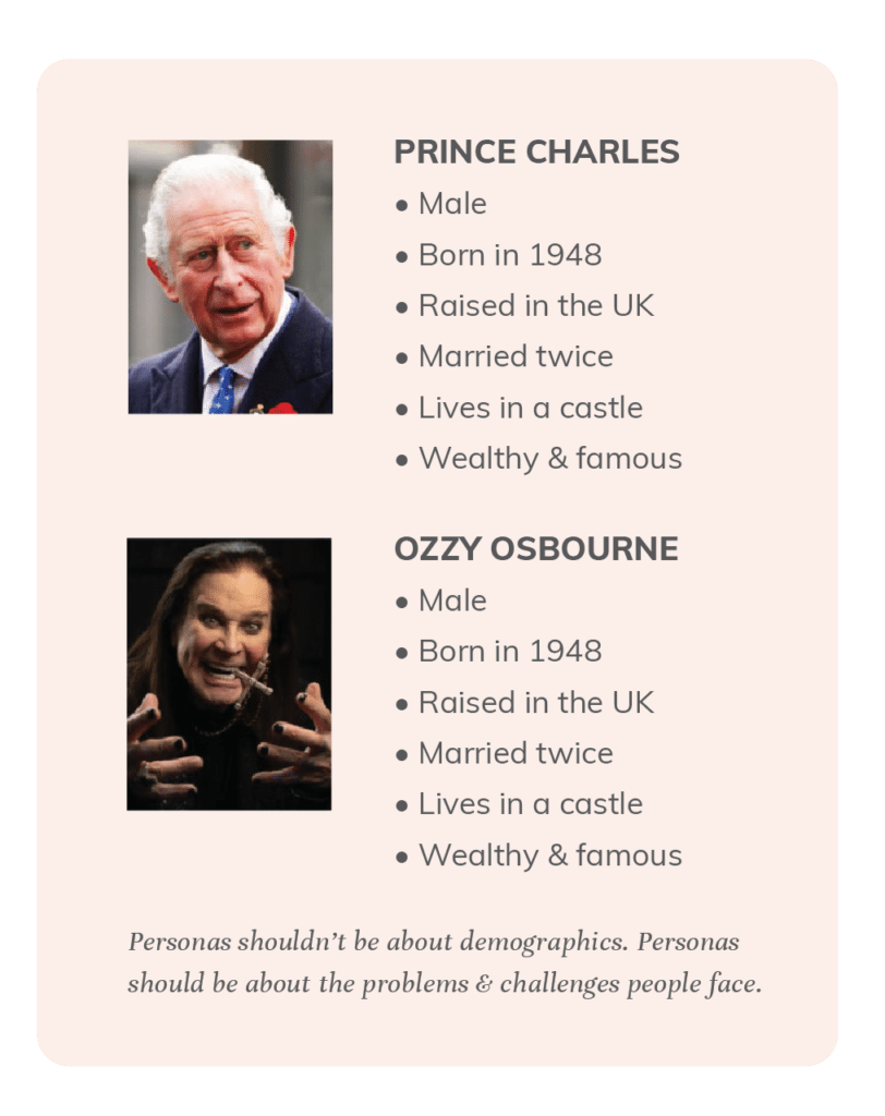
Personas are a mix of research and intuitive knowledge. They are often based on a customer profile you know well, and would like to attract more of. There is an art to creating the perfect mix and quantity of personas for your company. Creating too many will take you right back to trying to satisfy everyone instead of targeting your ideal customer. We suggest limiting it to 3–5, but it depends on the project.
We prefer to keep our personas high-level and glanceable—with just the photo, motivation, and quick comparison information.
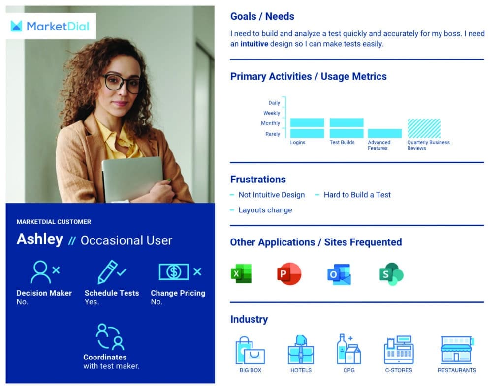
An example of a Persona Card we made for our client, MarketDial.
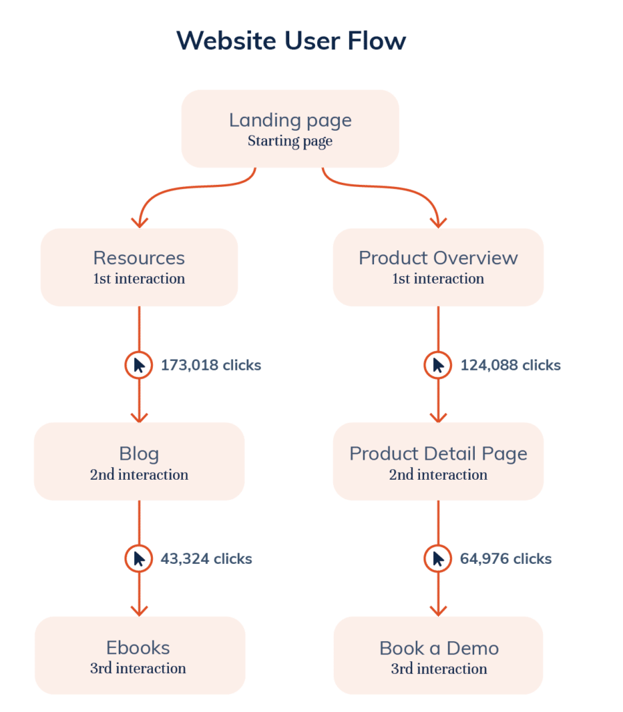
UNDERSTANDING AND CREATING WEBSITE USER FLOWS
Once you understand your personas, it’s time to evaluate how they use your site. There are a lot of ways to see what is happening currently—looking at Google Analytics Behaviour Flow, installing Hotjar, installing Full Story. Some of these options are free, some are paid, all of them will help you understand how people are using your site.
Now that you’ve had a chance to analyze the behavior of your visitors, you can start to think about how to better guide them through your site. This is where website user flows from a UX perspective come in. You may want people to go from the homepage to the resource center to download an ebook. Understanding your desired flows and how easy it is for users to follow them is a big step in improving the user experience of your website.
For a while, we had a homepage that we thought was cool and usable. When we watched the weekly Hotjar recordings, we figured out that people were flummoxed. We scrapped the homepage for the one we have currently. We always knew it was an experimental homepage, so we built the site so we could swap it with another whenever we wanted.
CONSIDERING ACCESSIBILITY: GOOD ACCESSIBILITY IS GOOD SEO
15% of the global population—over 1 billion people—have a disability. Considering how we design and develop websites for all users with an eye towards accessibility improves the user experience for everyone — and you get better SEO along the way!
Accessibility, like SEO, relies on good, semantic HTML. One (and only one) H1 tag, followed by H2s, H3s, and so on. When you structure a page correctly for screen readers, it’s structured correctly for SEO best practices.
Providing alt-tags, labeling buttons correctly, and making sure your videos don’t autoplay with sound are all ways you improve the UX of your website while meeting accessibility standards.
The Ultimate UX Accessibility Checklist
Colors & Fonts
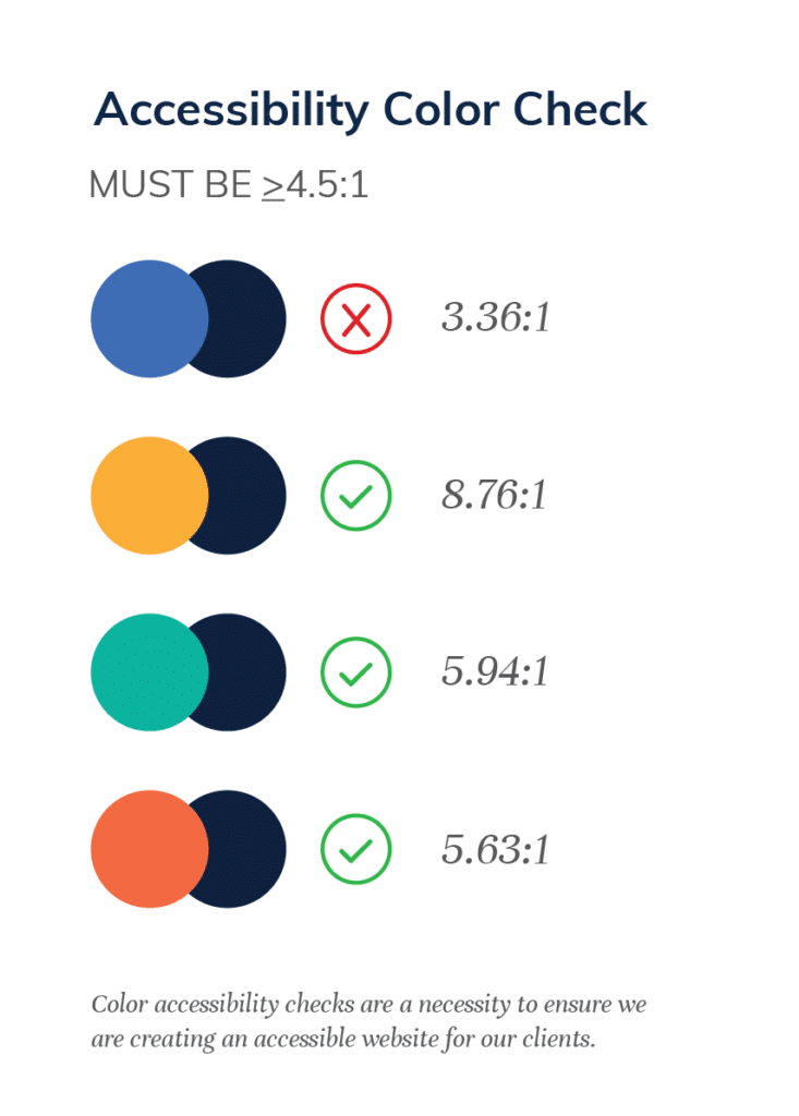
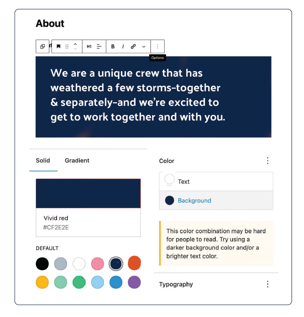
- Colors pass accessibility tests — 4.5 to 1 contrast. See Figma Plugins ›
- Fonts pass accessibility tests — at least 14px at the smallest, but we recommend 16-18px.
- Text is able to be resized 200% without the site losing cohesiveness.
- Text is generally left-aligned for English websites, don’t use justified text.
- Color (or other sensory descriptors) is not the only way to convey information.
- Links are recognizable as links.
Images
- Image descriptions—called alt tags—are in place. There is some great new AI software out there to help you write these tags.
- Text is not used in images if possible. This is good for accessibility and also supports multi-language websites and apps.
Audio & Video
- Audio and video have pause, stop, and mute.
- Audio and video have closed captioning for hearing impaired people.
- Flashing elements should not flash more than 3x/second.
- Audio and video default without sound.
Buttons
- Buttons use the <button> element.
- Buttons are labeled clearly.
e.g. use terms like ‘Download PDF’ and not ‘click here’. - Icon-only buttons have a <title> set to explain the functionality.
e.g. a search icon would have the title ‘Search’ set for screen readers. - Mobile tap areas are at least 44px—this is the size of a fingerprint.
Forms
- Form fields are marked as either ‘Optional’ or ‘Required’
Interesting note: When we worked with Optimizing Autism, they asked that we go with the ‘Optional’ note instead of the ‘Required’, stating a research-backed opinion that these users prefer the flag for what is optional instead of what is required. - Error messages are graceful and include help to complete the task.
- Focus states are clear so the user knows where they are.
- Items are not named with sensory characteristics.
e.g. ‘click the red button’ wouldn’t work, but you can say ‘click the cancel button’. - The correct keyboard is selected on inputs.
e.g. the number keyboard on mobile for phone numbers. The options are text input, number input, telephone number, search bar, email, and date.
SEO & Code
- Correct, semantic HTML is in place.
e.g. <nav>, <table>, <h1>, <button>, etc. - Only one H1 is used per page.
- Subheadings are used correctly and in order. Headings should not be used for typographic elements that aren’t headings, for example, a rubric should not be set in an H4 or H5 — anything that doesn’t have enough content under it to read as a heading shouldn’t use heading tags.
- Pages are well organized and still read and function correctly if the CSS is removed.
- Titles are less than 55-characters.
- Breadcrumbs are present on Resource Centers and other nested content.
- Tab order is correct and users can navigate a website using the keyboard only.
- The language attribute is set correctly in the HTML.
- ARIA roles and labels are set where appropriate.
- Don’t disable anything that impairs assistive technology—this includes zoom levels, CSS overrides, and screen reader access.
For additional tools and checklists, please visit The Accessibility Checklist
WEBSITE HEADER UX
We have two main teams at Anchor & Alpine, our UX team and our web design and development team. We always bring in a UX designer for headers, footers, and forms while the rest of the team decides the overall design of the website pages.
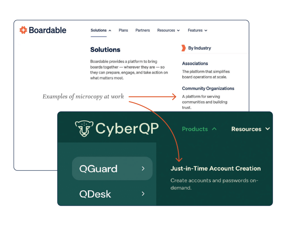
Website headers are either strictly limited and focused, which invariably gets changed once the site is launched, or they are mega navigations with options for nesting and descriptions. We often include microcopy in these to help users wayfind quickly and easily.
WEBSITE FOOTER UX
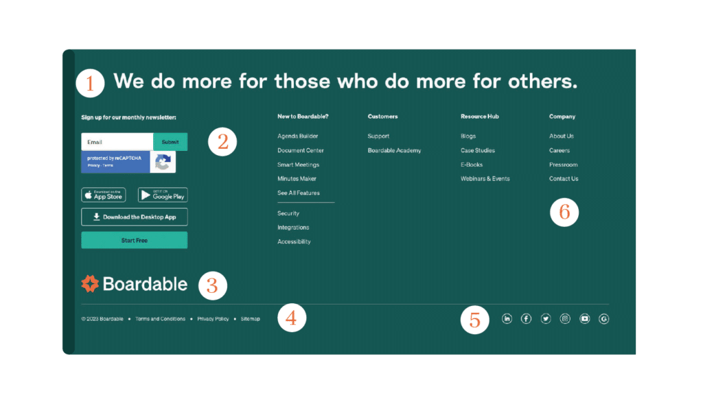
The website footer is your last option to catch someone if they have made it to the bottom of a page scroll. What helpful information should be in there?
- Site Writeup – Usually a one sentence synopsis of the brand’s ethos.
- Newsletter sign-up
- Site Logo
- Quick links – Things like a knowledge base, release notes, or help section.
- Social Media and contact information
- Website Navigation
DEMAND GEN UX
Many of our websites are designed and developed for demand gen (demand generation). It’s a term CMOs and marketing departments use to describe a site that is intended to collect leads for a sales team.
One recent project was able to deliver these results:
- 89% reduction in bounce rate
- 92% increase in time on site
- New ABM capabilities for personalization supporting new leads with a 25% close rate
- Increased inbound leads
Demand Gen on a WordPress website consists of contact forms, download forms, and often a robust Resource Center with lots of content types and topics, all with the goal of ethically and helpfully acquiring contact information to move the conversion forward.
A UX designer comes in and designs friendly forms that people actively want to use. They test forms end to end and often create complex forms to segment and drive leads to the right place. Several people will go through and test forms in a variety of environments: desktop, mobile, PC, Mac, drunk, stoned…(mostly kidding on the last two).
UX Design Checklist for WordPress Websites
ALL STATES DEFINED FOR WEB STYLES
- Link: Normal/Default, hover, focus, visited.
- Text: Headings (H1–H6), body, hyperlinks, buttons, tooltips.
- Forms: Normal/default, active, filled/completed, error.
- Buttons: Default, hover, focus, disabled, secondary, tertiary.
IMAGERY
- Images are good quality, optimized, and correct format (jpg, gif, png, vs svg).
- Name your SVG assets in figma.
- Images are licensed for commercial usage.
- Images are appropriately attributed if that is part of the usage license.
- Images show a range of visible diversity of people.
- Images all have alt tags following the recipe object → action → context.
- PII has been redacted in images.
TYPOGRAPHY
- Specify Google Fonts or plan for a budget to purchase fonts.
- No type under 12px (we like big type).
- Font size is at least 14pt.
- Color contrast ratio is 3:1 for large text and 4.5:1 for small text.
- Color contrast is 3.5:1 (AA) or 4.5:1 (AAA) or higher (use Able in Figma to check).
- Page is set up according to semantic HTML standards, H1, H2, H3, etc.
- Buttons are labeled clearly (i.e., “Accept” not “Yes”).
UX NICETIES
- Time zones given on time listings.
- Review project text formatting, match titling, and punctuation.
- Buttons are labeled clearly (i.e., “Accept” not “Yes”).
DON’T FORGET TO DESIGN
- Back to Top Button.
- Hide/Reveal Navigation.
- Favicon: the small image that appears at the top of browser tabs, in bookmarks, and on app home screens.
- Breadcrumbs: a user-beloved method of navigating through nested topics.
- Thank you state or page for forms.
- Helpful and informative 404 Page.
- Author Pages: a page linked to an author’s name for resource pieces that provides a small biography and photo.
- Search Results: page design for results from search bar for both navigation search and resource center.
- Category Pages: the default page created when categories are assigned.
The Best User Experience (UX) for the WordPress Admin Area
Sometimes WordPress really sucks to use. Yeah, I said it, even though I love it, and we’ve built our business around designing and developing for WordPress. It’s still a content management system (CMS), and we’re still not quite there for a what you see is what you get (WYSIWYG) editor. There are a few tricks and development tasks we can do to improve the UX of working in the WordPress Admin area.
THE WORDPRESS ADMIN AREA IS OVERWHELMING
The first and best thing you can do for your WordPress editors is to walk through a good setup with them. This is how a WordPress admin area and pages list looks out of the box:
- From the Dashboard, go to Screen Options (it’s a tab on the top right of the screen) and go to Screen Options (top right tab) and turn off everything you don’t need.
- Change the columns on the posts page to display the most important information you are working with on your bulk post view.
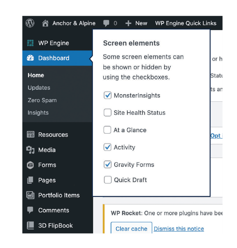
By spending a little time configuring your workspace, you will have a much better editing experience as a WordPress Admin. A big part of UX is figuring out what to take away to preserve focus for the user, but then making sure they have what they need when they need it.
TRAINING CLIENTS TO HAVE A GOOD USER EXPERIENCE
Like many things, learning to use WordPress efficiently and effectively takes a little time. It’s about a 30-minute learning curve if you sit down with your web design agency for a quick lesson. We also create and host a set of videos to help our clients with different WordPress tasks. We are always just a phone call or a Slack message away when our clients need help.
CUSTOMIZING THE WORDPRESS EDITING EXPERIENCE FOR BETTER UX
Choosing a web design agency that specializes in WordPress, like Anchor & Alpine, can help you get the very best out of the popular CMS. At the start of a project, we tell clients, “If you are doing something repetitive in WordPress, let us know, we can often make it easier or more functional.”
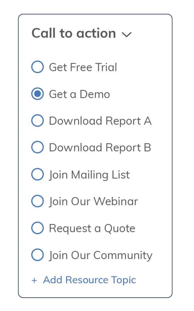
A good example of this was our client Procare. They mentioned forgetting to include a call to action (CTA) on their blog posts and wanted to be consistent with them. They were originally using WordPress Reusable Blocks to put in the CTAs. That works great…unless you forget to add them!
We created a radio button group of choices for CTAs. There was a default set for each, in case you forgot to select it. Then each time we added a new CTA, we would add it to the radio group list, so Editors could stay consistent with their demand-gen CTAs across the website.
CUSTOMIZING WORDPRESS COMPONENTS
Another small thing with a big impact on the overall user experience of a website for editors is to spec out the right colors and buttons in the editor.
We update the built-in color picker per client to match their brand standards.
UX for WordPress Website Development
How your WordPress site is developed will have a huge impact on the UX for website visitors and WordPress editors. We’ve seen too many sites that look great but don’t work quite right, costing companies hours of work trying to navigate how to make simple updates or changes. We’ve run into this on the front-end website and on the editing experience.
There are several things you can consider during development that will give you a better UX and lower the cost of website maintenance overall.
PIXEL-PERFECT MATCHES TO CLIENT-APPROVED DESIGNS.
Our front-end developers join our weekly design critique. That way, they know what we are thinking up, can offer input and advice, and are ready to hit the ground running when the designs are approved for development.
We keep all designers and developers in-house, we never offshore or subcontract our work, which means we’re all building the best experience together. Our developers create websites that look exactly like the design—but they work! They work as designed and as expected.
USER ACCEPTANCE TESTING (UAT) IN MODERN BROWSERS
Pixel perfect designs and well-developed WordPress backend code come together for final inspection in our quality assurance (QA) pass, sometimes also called User Acceptance Testing (UAT).
We have an in-depth QA checklist we use on all sites to ensure that everything is as easy and intuitive as the UX designers designed. We call in different levels of technical people, as well as people who know everything and others who know nothing about the project. Our websites are reviewed by the developers and designers of the project and often someone that hasn’t been as involved, like our General Manager or our UX Researcher. Oftentimes the testers that go in cold find the best stuff.
In our agency’s early days, we employed my mom to do our UAT. It really can be all hands on deck when you run a small crew!
WORDPRESS MANAGED HOSTING
We recommend WordPress-specific managed hosting. The servers are faster, better secured, and often run a lot of processes to ensure that malware isn’t installed via plugins.
We host everything at WPEngine, but other reputable hosting companies are included here. There are a few popular hosts we strongly discourage for a variety of reasons. If you’d like to chat about these, reach out to discuss why.
Reputable Hosting Companies
Post Website Launch WordPress UX
Once your site is live, there are a few things to keep an eye on to ensure long-term UX success.
WATCHING ANALYTICS
In the weeks and months post-launch, checking in on your analytics regularly is important. You’ll want to know how the new site compares to your last site so you can share ROI throughout your organization.
Google Analytics and Google Search Console are often the places you’ll first notice an anomaly or weird piece of data you want to dig in to ensure it isn’t negatively impacting your website user experience and conversions.
MAKING WORDPRESS ADMIN ADJUSTMENTS
When we launch a site our clients usually stick around for a few months of post-launch work (and then most of them—93% in fact—come back for additional projects). During this time, we make any adjustments to the WordPress admin area, such as adding a CTA picker for our client.
We also smooth out anything that seemed like a good idea in design and development, but usage data tells us we need to change something here or there.
KEEP AN EYE ON WORDPRESS SECURITY
Nothing ruins your UX like your site being down, hacked, or generally messed with. WordPress security starts with the plugins we install and how we develop them.
Weak usernames and passwords are usually the first way a site is breached. Never use the username ‘admin’ and never EVER use the password ‘password.’ Once a quarter, go into WordPress and review your users list. Ensure everyone has the right access, and everyone that is listed should still have access.
We gained a client by answering a call about their website that had been hacked. They were locked out and their site was down. We were able to get back into the site, find the plugin that allowed the hack, remove it and get the site working again.
When we review WordPress plugins we look at three things: the last update to the plugin, the number of downloads, and the support channels for that plugin for anything unusual.
WordPress Development Checklist for Good UX
Just like our accessibility checklist and design checklist above, we have created a list of tasks we know improves the UX of WordPress sites. Some of these are redundant on the design list.
ALL STATES DEFINED FOR WEB STYLES
- Link: normal/default, hover, focus, visited.
- Text: headings (H1–H6), body, hyperlinks, buttons, tooltips.
- Forms: normal/default, active, error, filled/completed.
- Buttons: default, hover, focus, disabled, secondary, tertiary.
TYPOGRAPHY
- No type under 12px (we like big type).
- Font size is at least 14pt.
- Color contrast ratio is 3:1 for large text and 4.5:1 for small text.
- Color contrast is 3.5:1 (AA) or 4.5:1 (AAA) or higher (use Able in Figma to check).
- Page is set up according to semantic HTML standards, H1, H2, H3, etc.
- Buttons are labeled clearly (i.e., “Accept” not “Yes”).
DON’T FORGET TO DESIGN
- Back to Top Button.
- Hide/Reveal Navigation.
- Favicon: the small image that appears at the top of browser tabs, in bookmarks, and on app home screens.
- Breadcrumbs: a user-beloved method of navigating through nested topics.
- Thank you state or page for forms.
- Helpful and informative 404 Page.
- Author Pages: a page linked to an author’s name for resource pieces that provides a small biography and photo.
- Search Results: page design for results from search bar for both navigation search and resource center.
- Category Pages: the default page created when categories are assigned.
REMOVE UNNECESSARY FILES AND CODE
- Page templates
- Template parts
- JS
- Other packages that might be installed
- Comb through files and make sure website name is present in place of “sandbox text”
- Comb through SCSS files and remove unneeded CSS, set up new variable names and values (fonts, colors, margins, site widths)
- Install Plugins: Safe SVG, Anchor & Alpine Plugins (Resource Center, Simple FAQ, Simple Testimonial), Yoast Duplicate Post
- Finalize and Import Redirects