1800 Park
Spurring Excitement for the Rejuvenation of a Park City Landmark
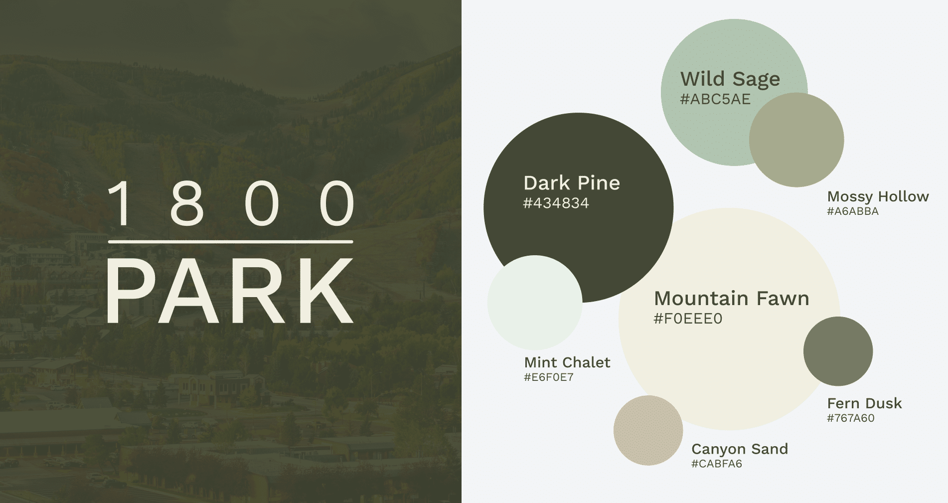
Tucked in the mountains of Park City, our client, 1800 Park, needed a preliminary brand to represent their new building endeavor. A hub for community gathering and housing, they wanted their branding to reflect the infinite number of green hues visitors will be surrounded by when enjoying the property. We created a sage and pine-based color palette, with a naming system befitting this mountain oasis.
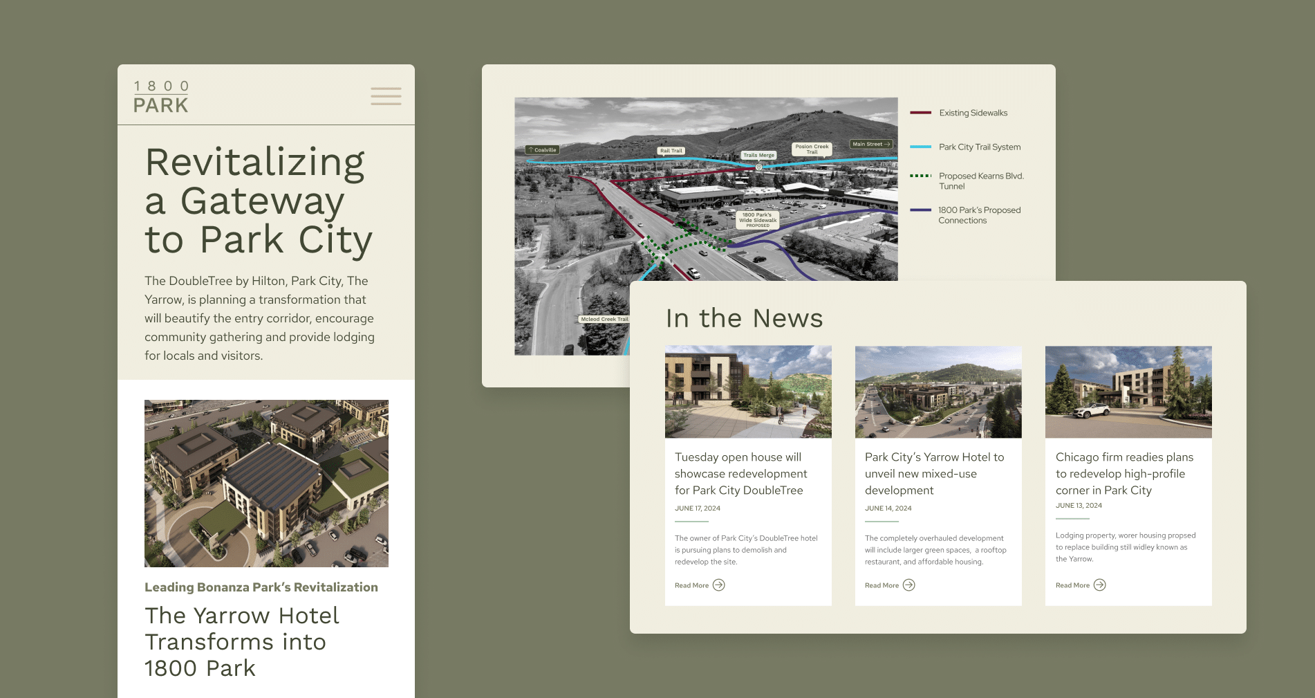
For their website, to exhibit their proposed revitalization, we proposed site visitors be greeted by a bespoke fade-in animation with styled captioning. Site visitors get to experience the transformation unfurling before their eyes
Beyond a news section and image galleries, we created a unique ‘About’ page. The challenge was creating a informationally dense page for the Park City planning board to be able to review with ease. Sure, we could have broken up the information into stand alone pages; but we didn’t want to risk site visitors losing interest and missing details that makes this project so desirable. Our solution was to design a sticky side-bar navigation that highlights what section you are reading, allows you to jump to whatever information you are looking for, and entices you with content that maybe you weren’t aware you were interested in.


