Millcreek Common is the central gathering spot and new city center for the residents of Millcreek and the surrounding area. We brought together historical influences with fresh clean lines to create the logo. The city is named after the mill work that was done when the Utah Mormon Pioneers settled the Salt Lake Valley.
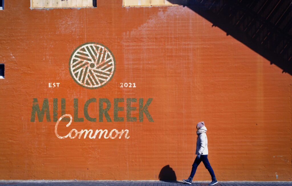
We used the millstone as our central element, typography that evokes old hand-painted signs we found when we poured through the Utah State Historical Archives, and modern type to pull everything together. We created an in-depth branding guide that includes tone of voice and logo alternates.
Research
We deployed the entire crew, and a few friends to photograph branding and signage at other public areas around town. We compiled the photos into a sortable catalog so we could review all the examples of elements for one installation, or compare similar signs across all installations.
Typography
We had a strong graphic with the millstone, but wanted to make sure the Millcreek Common logo was more than just the round element. We stayed true to the history of Millcreek and chose two typefaces—a sign painter font and a cursive font that would evoke the rich history of neon work in Millcreek and the surrounding areas.
One of the interesting things about looking at historical typography is that it is heavily influenced by the way in which you make the mark. Cuneiform writing looks like the stylus and clay tables used to produce the letters. Greek-style serif lettering fits a chisel to stone.
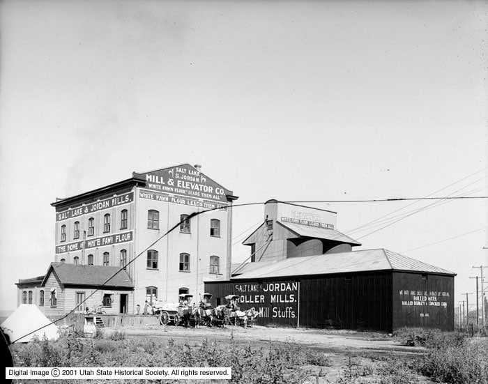
Salt Lake & Jordan Mill, 1909. © 2002 Utah State Historical Society. All Rights Reserved.
Since we knew there would be a lot of applications of the logo we opted for typefaces that would be hardworking in the conditions which they were going to be used for — painted, stamped, made of neon.
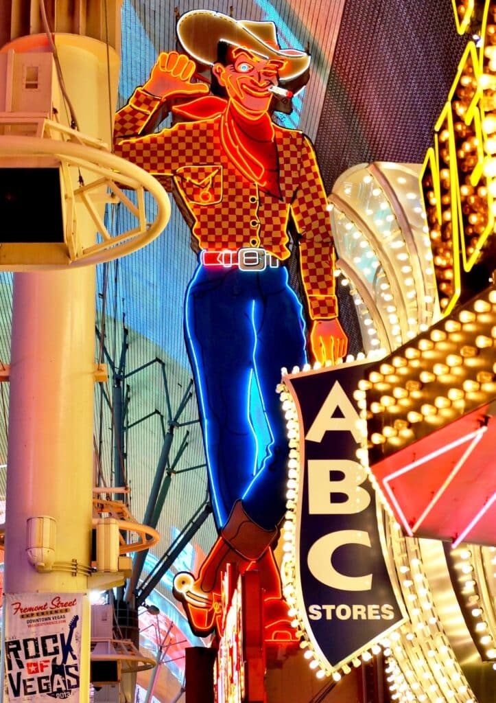
Neon in Utah
We have a lot of neon signs in Utah, thanks in part to a man named Thomas Young who, in the 1920s studied neon sign making in Paris before returning to Utah. He was the right person at the right time to head out to a little-known railroad stop in the desert in 1938 where, just a year prior, gambling had become legal. By the end of WWII Las Vegas was booming and the Young Electric Sign Company, now called YESCO, was doing one hell of a business.
Reserved.
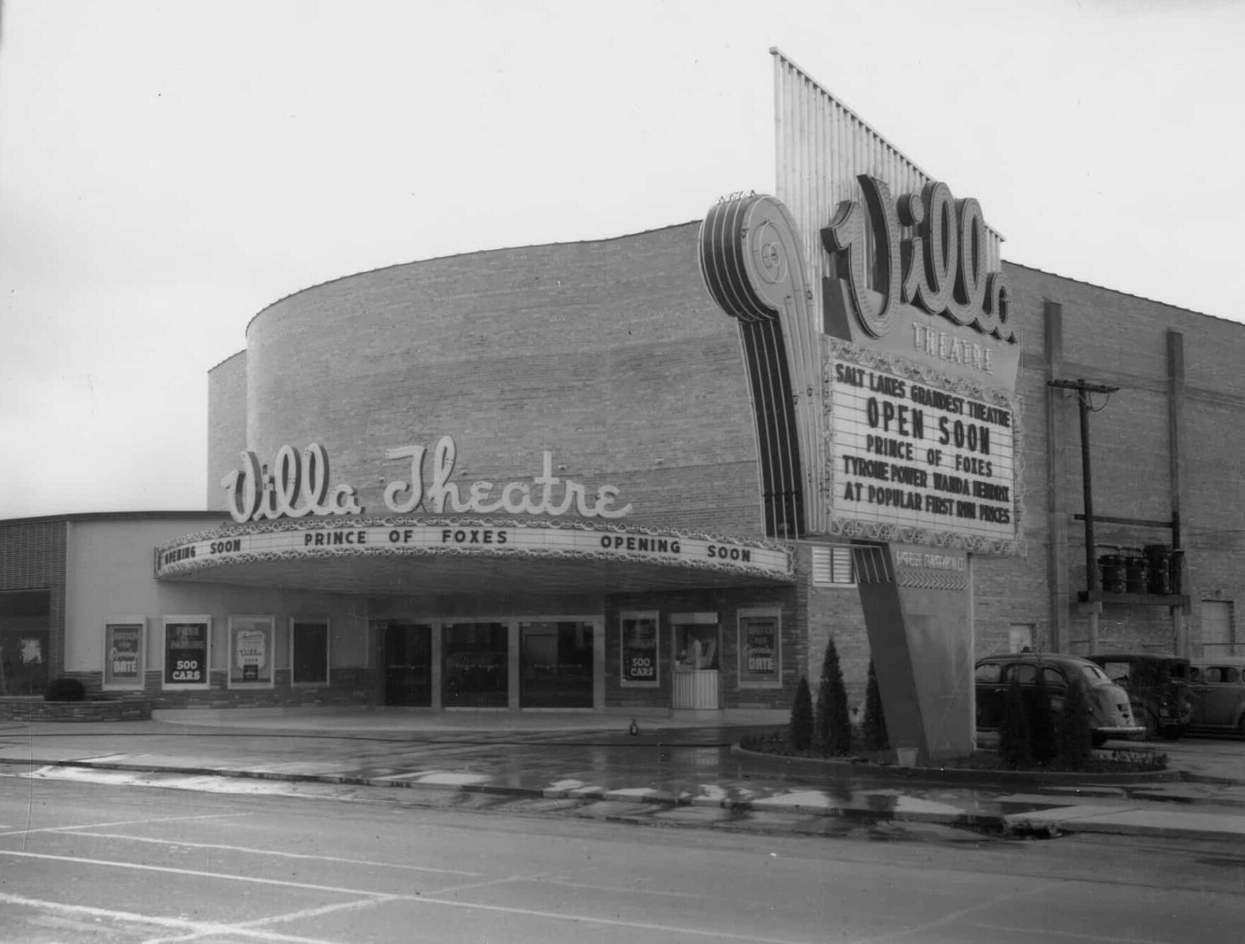
Throughout Salt Lake City, Provo and Ogden we have some amazing neon signage, and Millcreek is no different. From the Villa Theater to the Ritz Classic bowling pin and even the signs on Dee’s, the history of neon in Utah is fascinating.
YESCO owns and operates the famous Welcome to Las Vegas sign as well as two giant cowboy signs, Vegas Vic and Wendover Will.
This article appeared in the Fall/Winter 2022 issue of the Anchor & Alpine Magazine.