
Our long-time client, MarketDial, started as a UX client before becoming a web client. MarketDial creates retail testing software for companies like Maverik, The Container Store, Calvin Klein, and Five Below. These retail customers run tests to determine full-scale impact and then roll out the tests that look promising to physical stores nationwide.
Like many of our current Product UI/UX projects, we worked closely with data scientists and engineers to translate the power of what they can do to a UI that harnesses that power for a variety of business users.
Space to Breathe
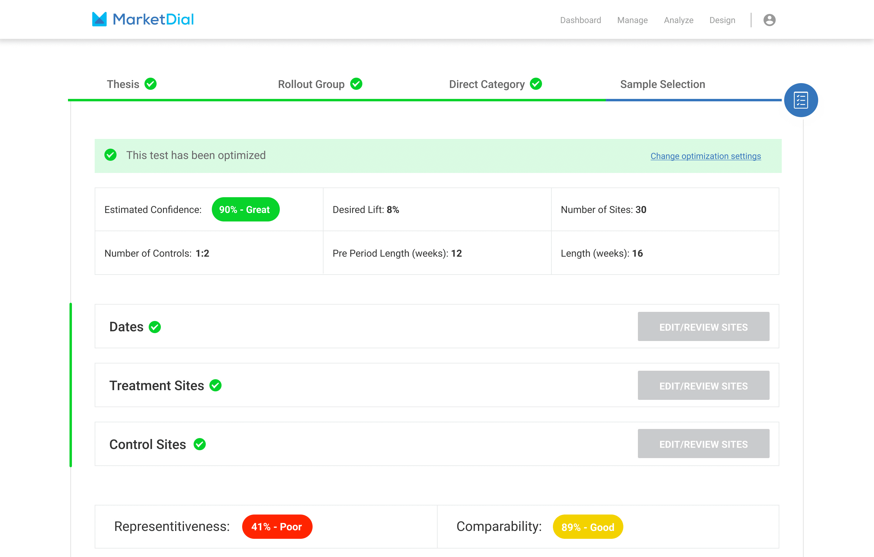
With densely packed screens and sophisticated software capabilities, one of the most challenging aspects of projects like this is getting the spacing correct.
The app works in a nested way with several steps you need to take. While most of those steps will be in order, there are times that changing something in a later stage will cause you to need to make a change to an earlier step. Our charter was to help the user focus on the task at hand and allow them to move seamlessly between tasks without getting lost.
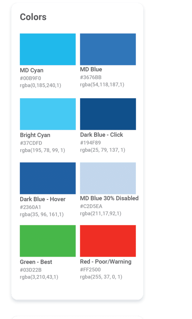
Definitive List of Product UI Colors
Like most products, the MarketDial Product UI matches their original brand and color palette. In addition, they have indicator colors and a selection of grays. For their product and every other product we work on the user interface for, we recommend the following palettes that work well together:
Brand Colors
Your primary brand colors and shades of those colors.
Indicator Colors
You will need the standard indicator colors of green, yellow, orange, and red. If your brand colors have any of these colors, having a separate indicator color is often a good idea. So if your brand uses a dark forest green, your indicator for ‘success’ would be a bright kelly green.
Rainbow Colors
This is where brands and user interfaces diverge. In brand color palettes, you want to limit the number of colors to help keep the brand consistent and to help your customers recognize you without a glance. Where would Tiffany’s be without their blue, T-mobile without magenta, or Starbucks without green? Those confined palettes are a MUST for brand design, but you also need the entire rainbow for user interface design. You don’t use the rainbow throughout your product, you still stick to your main brand and indicator colors, but most products will hit a point where you need a chart, graph, or report. Those elements need additional colors to have them make sense. The rainbow palette should be in the same overall value as the rest of your palette. MarketDial’s product color palette is bright, almost neon, colors.
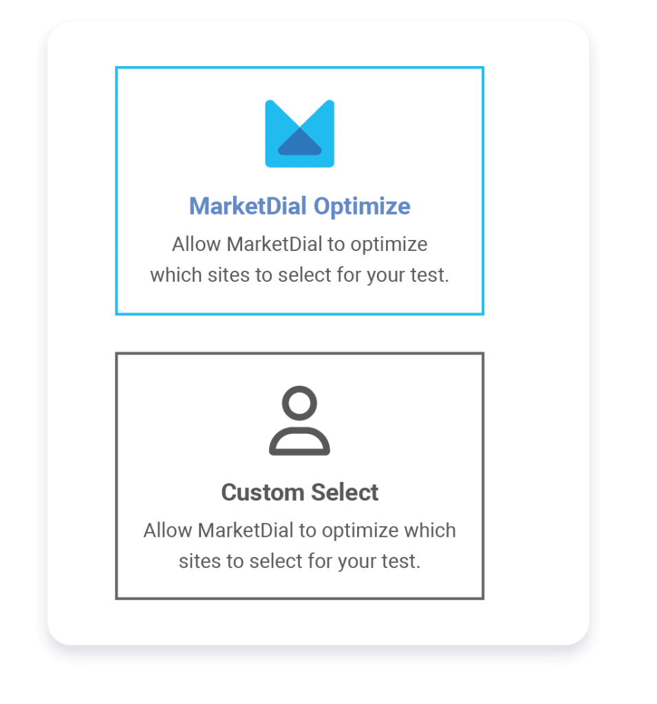
Optimizing User Journeys
Understanding the entire platform and how users get from one point to another is vital to this project. We sat down with the product manager and mapped out the entire flow and all of the dependencies in the product. We did it the old fashioned way, with markers on paper, and it took us 2 feet by 7 feet to map it out. From there, we could determine what could be streamlined and at what point we should offer the choice of different paths.
For this project, we started with large tiles so the user could decide how much help they wanted. Once they have chosen their adventure, the streamlined pathways present users with well-designed choices at pivotal points.
Final Thoughts
Our collaboration with long-time client MarketDial has been a rewarding Product UI/UX journey for both of our teams. MarketDial’s retail testing software serves an array of prominent companies, and our challenge was to harness the power of data science and engineering into an intuitive and seamless user interface. Among the many intricacies we encountered, spacing proved vital, as we sought to provide users with a clutter-free environment while enabling effortless navigation between tasks.
This article appeared in the Fall/Winter 2023 issue of the Anchor & Alpine Magazine.